Have you seen a Hyundai lately? Yes. You heard me. A Hyndai. This low-cost brand has been the ugly step-child of the US auto industry for some time now, but just yesterday I pulled up to a new Hyundai Sonata.
And my design jaw dropped.
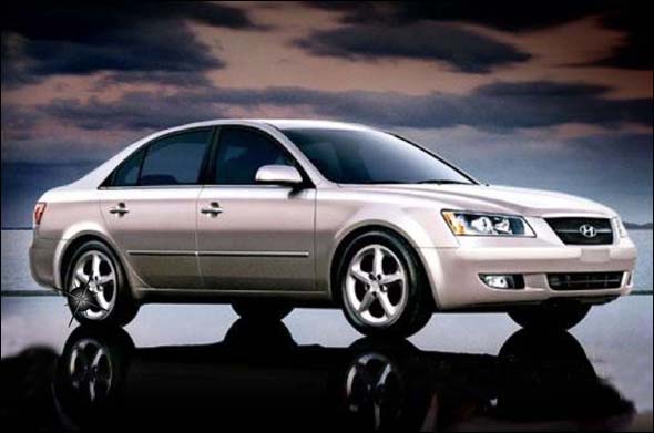
Here is the Sonata before:

Really – this is your run-of-the-mill, bland, mediocre, sedan. This doesn’t say anything but functional, practical, low-cost, lazy.
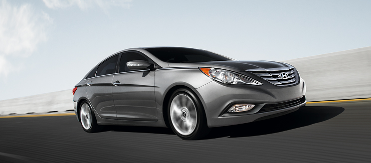
I now give you the 2011 Sonata


I’m not a car guy at ALL… but this is SOOO head and shoulders above the previous model, my designer-mind couldn’t resist figuring out what is going on over there at Hyundai. Even just pulling up to the rear end, I couldn’t believe the character it had. Then, following the side panels to the front view, it had impressive use of line and curve to make it look both sporty and luxurious.
What a design transformation. I would actually buy a car that looked like that.
Doing a bit more research, it turns out that Hyundai has been investing in design for the last decade, bringing up design centers in California and Germany, and are starting to pay attention to the design of their vehicles.
Way to go Hyundai.
http://online.wsj.com/article/SB10001424052748704754604575095102431859856.html
