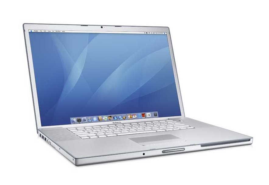
After four years of loving my old, 15″ MacBook Pro, one of the first Intel machines to roll out of Apple’s headquarters in January 2006, my well-used friend is going the way of all computers – to the recycle bin – to make way for a new era in WhiteEyebrows computing…

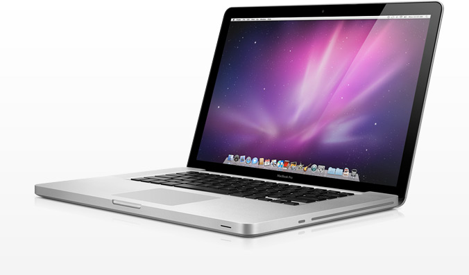
…My shiny new 15″ MacBook Pro!
While the computers share the same name, don’t let them fool you. This is a great advancement in both hardware and software!
Here is my initial design review after using this computer a week.
Unibody: The biggest design advancement in this machine is the fact that the base is carved out of a single, solid block of aluminum. Its biggest advancement is also it’s best. This manufacturing process gives the computer an incredible rigidity not found in any other laptop I’ve ever used. The case will definitely not suffer from the same fate that my four-year-old Mac did, with the various adhesives and fasteners coming loose and with various parts of the case starting to come apart from the others.
Keyboard: Initially, I didn’t think I’d like the new keyboard. I liked the look and feel of the old one and thought that the new design would prevent your fingers from as easily sliding from key to key. However, I like the new keyboard. It feels less mushy that the last one, and is very tightly sealed. I’m not willing to spill a Diet Coke on it to test the seal, but my guess is I’d have less seep-through with this keyboard than with the last. Apple has also updating the functions of the F Keys. The old MacBook had several functions that were missing (music controls) and were poorly labeled. It looks like they’ve re-prioritized the functions as well as refreshed the icon design on the keys. Works for me.
Color Scheme: The introduction of black-on-grey give teh computer a slightly more serious look, and is a bit more dramatic than the old grey-on-grey approach. Also, the black band around the display helps focus your eyes on the screen, rather than the boundaries around the screen. Nice touch!
Screen: Speaking of the screen… I have a few gripes here. Glass. I hate the glass. A great majority of Apple users will use this computer around a light source, probably a fluorescent one, which is gonna glare like MAD on the glass covered screen. I know they offer a non-glare screen (which essentially removes the glass and puts a grey border around the screen), and I would have gotten it had my work offered the option. Matte! Matte, people! I don’t want to be looking back at myself every time I look at this computer!
The glass does offer one or two advantages, though. My old MacBook, over time, saw permanent imprints from the keyboard on the LCD. It didn’t degrade the actual usage of the LCD, but was noticeable when the machine was turned off. Also – fingerprints. I hate when people come and touch their grubby, oily fingers on my LCD screen, and this glass will at least prevent them from poking their pointy little fingers through the backside of my LCD and permanently ruining the color in that particular spot.
Overall, the LED backlit display is brighter than its predecessor. I like the power-savings from the LED backlight on this display, but Apple has traded off a lot of color accuracy for brightness in the default configuration. You’d better believe that a graphics professional, such as myself, will have to calibrate the heck out of this thing so that blacks look black and not grey. It’s a dirty trick to play on users, but one that makes them look awesome.
Ports Plugs and Drives: This one is easy. I like the DVD drive’s move to the side of the computer, and the slot-load (as opposed to tray load) has always been one of my favorite Apple details. With the DVD on the left, all of the ports have been moved to the right, which actually helps the user locate the correct port. No more picking up and rotating your computer looking for the location of a particular port! Even people who own computers forever forget where their ports are when they are divided between sides like that. The built in SD card reader is a great addition, but I’m no fan of the new MiniDisplay port. I just don’t like the fact that it now requires me to carry around and keep track of yet another doohickey! (A doohickey is the technical term for the adapter that allows you to convert MiniDisplay to VGA or DVI) I love that Apple lives on the edge and is a leader in display technology adoption, but VGA is just not dying fast enough in today’s world!
Odds and Ends: I like the multi-touch mouse pad, but it has taken some getting used to. I’m trying to master the art of one-handed drag and drop and other new gestures it has enabled. Ninety percent of the time, though, I find myself clicking exactly where the the mouse button used to be on the old trackpad. So, I guess it’s good that Apple left the size and proportion of the trackpad area alone so it wouldn’t be as error prone.
My coworker also pointed out the pointy edges near the trackpad (the part that is carved out so that you can lift the lid). While I have yet to draw blood on this part of the computer, it seems like something Apple could have very easily refined in the aluminum milling process.
Lack of Removable Battery: This is my greatest point of contention with Apple. Battery technology has NOT advanced to the point that a computer with a life of 3-4 years will not need a fresh battery sometime in there. In fact, I changed the battery in my old computer 3 times during its lifespan. Especially for the everyday user and mobile user, a new or extra battery is crucial!
Software: Snow Leopard is great, though it’s nothing to really write a long blog about. It’s just better in every way, but not in any single way. I like the inclusion of a native Cisco VPN. I like the clean break from the PowerPC architecture. I like the native Exchange support.
Well, I think that’s all. Happy computing, everyone!
